


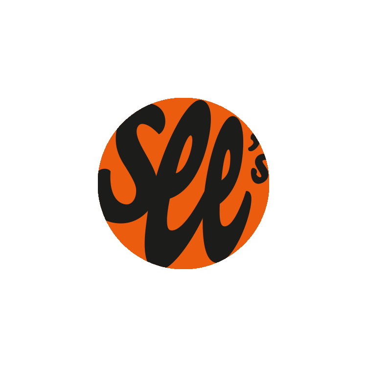


Personal project — A friend gave me the idea to redesign See’s Candies logo, and I said “OK!” I learned that Mary See had a sunlit Los Angeles studio, and I instantly loved the idea of sunshine and chocolate. My goal was to create a modern typographical logo with color. To switch up the classic square checkered pattern, I played with overlapping circle shapes - creating a new shape of a sunburst.